Overthinking GIS
A roundabout way to downsampling data
Maps in the Modern Era
GIS is probably one of the best things to happen to cartography in the last couple hundred years. I say that with absolutely no knowledge of the history of map making, but GIS is wildly useful and consistent in how it is presented on publicly-accessible sites. I can go to the USGS National Map Viewer and am presented with more data and information than I could possibly ever find useful.

Even more surprising is that county-level GIS websites look similar enough to the national map and other county maps that someone just roughly familiar with GIS and layers can find more granular information about a single parcel of land. Personally I don’t have a use for a color-coded sale year plot, but this county in Georgia provides it. The breadth and depth of information to the general public is incredible.

Custom Metrics
Still though, all of this information is quantifiable because computers don’t speak human languages (LLMs are still just math) and what I wanted is something more human-centric, more qualitative: usability. I’m defining usability as “not too steep to build on” which sounds straightforward until you actually try to come up with a number that defines that. The closest thing to my usability metric is grade and while the USGS map provides elevation and topographic information it does not tell me the grade, at least I couldn’t find that option in the layers. If a GIS wizard out there wants to point me in the direction of a grade map it would make my life a lot easier.
I decided to define usability as the average grade for some area of land. Ok, great, but how do I calculate that with the data on hand? The USGS map provides topographic lines, and past experience reading topo maps has taught me what “too steep” is, but that’s the result of over a decade of hiking and reading maps. How do I tell the computer “when you see topo lines close together it’s probably too steep and has a low usability score”?.
In this section of map the grade on the Western side of the river is too steep to use, but the flat area on the Eastern side is perfect. Topo lines close to each other indicate steep terrain, and lines far apart indicate flatter terrain.

Source Data
Topo maps are available for download from the USGS site, but that’s just a map and isn’t very useful to the computer. I suppose using thresholding I could select only the topo lines but that still doesn’t give me the usability score I want. Digging deeper, the topo maps are derived from elevation data and that is also available to download. Multiple sources and derived products are available, and I chose the highest resolution data offered which is the DEM source in ~3m resolution.

I verified the resolution with gdalinfo looking at Pixel Size:
$ gdalinfo steep_north_tile.tif | grep Pixel
Pixel Size = (3.125000000000000,-3.125000000000000)
Calculating Usability
With the source data downloaded it was time come up with a calculation for my usability metric. As I said earlier the closest common value to what I want is grade. Grade can be defined as “rise over run” or $y=mx + b$ where $b$ is 0 and we don’t really care what $y$ is. The value we care about is $x$, the slope of the terrain. This works for a 1D case but I want to take into account slope in two directions so we have to move up from middle school math to calculus, specifically vector calculus. In vector calculus the gradient describes the rate of change of a function in multiple directions (dimenions) and is just the partial derivative of a function for a given direction. If I have some function that describes how how the land is shaped and I wanted to find the rate of change (grade) in the $x$ direction I would calculate the partial derivative of the function with respect to $x$, and similarly for $y$. The first derivative gives us the slope, and the second derivative gives us the rate of change of the slope. This rate of change of slope is “how close are the topo lines?” described mathematically.
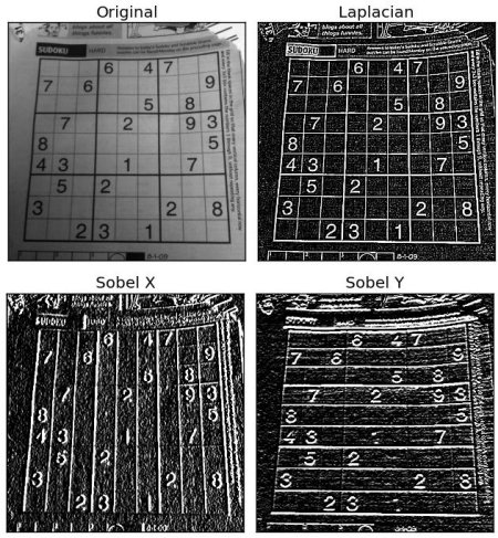
Glossing over a lot of details, there is a mathematical operator called the Laplacian that calculates the second order differential for a scalar field. In practical terms what that means is that it calculates the rate of change in the intensity of pixels in an image. An even more hand-wavy and pratical explanation is that calculating the Laplacian shows us where in an image the pixels change for both the X and Y directions. OpenCV’s documentation does a good job of explaining this and has a great example image showing the partial derivative in the X direction, the Y direction, and both.
Doing the same thing with the data I have on hand takes just a few lines, including plotting the result. plt.clim is used to set the limits of the color mapping and enhance the contrast in the resulting plot.
import cv2
import matplotlib.pylab as plt
import numpy as np

def normalize_array(array):
    array_min, array_max = array.min(), array.max()
    return (array - array_min) / (array_max - array_min)

def get_laplacian(f: str):
    img = cv2.imread(f, -1)
    # Normalize the data and set to a max of 255
    norm = normalize_array(img) * 255
    # Set data type to 8-bit integer for processing
    norm = norm.astype(np.uint8)
    return cv2.Laplacian(norm, cv2.CV_64F)

l = get_laplacian('steep_tile.tif')
plt.imshow(l)
plt.clim(-1,2)
plt.show()

This looks a lot like topo lines but inspecting individual pixels it’s evident that both positive and negative values exist. What we’re seeing here is the second-order derivative which is the rate of change of the pixel values, or in human terms this is how quickly the grade changes. When looking at a topo map if the lines are close to each other we would expect to see a (relatively) large value in the plot above, and for an area where topo lines are far apart we should see a value of 0. Comparing the plot against a topo map for this section of land it’s evident that what we’re seeing does in fact describe the steepness of the terrain. Note the zero values (green) along the road, and higher values (yellowish) on the adjacent hill.

We now have a plot describing how close topo lines are and the next step is to calculate the average value for a given area. To accomplish this I used a sliding window that moves across the image and returns the values just inside that window.
def sliding_window(image, stepSize, windowSize):
    # slide a window across the image
    for y in range(0, image.shape[0], stepSize):
        for x in range(0, image.shape[1], stepSize):
            # yield the current window
            yield (x, y, image[y:y + windowSize[1], x:x + windowSize[0]])
I can then calculate the average value of the window and store that in an array to be plotted later. Using some known-good examples of steep and “flat enough” land I arrived on a mean value of 0.45 being too steep. If a tile’s average rate of change is 0.45 or above I set it to a high value of 0.75, otherwise it’s set to zero. This will result in a binary “usability” map. Done!
# Each pixel is ~3m, set the window size to 30m
stepSize = 10
windowSize = (stepSize,stepSize)
l_mean_map = np.zeros_like(l)
for (x, y, window) in sliding_window(l, stepSize=stepSize, windowSize=windowSize):
    this_reading = 0
    # Threshold based on known-good values
    if window.mean() > 0.45:
        this_reading = 0.75
    l_mean_map[y:y+windowSize[1],x:x+windowSize[0]] = this_reading
Overthinking It
Plotting the usability map, raw Laplacian, and raw source data all next to each other it’s clear how this is effectively just a very complicated downstampling method, hence the blog post title. I need to confirm this but I could probably achieve a similar result straight from the Laplacian by downsampling / blurring with a kernel size set to stepSize. Oh well, at least I have a lot of knobs to turn in case I want to tweak more parameters in the future.

Usability Equation
$U_{(i,j)} = \frac{\sum_{k=0}^{n}\nabla^2F_{(i,j)}}{n}$
Where $F_{(i,j)}$ is the window that slides across the image.
Update
I’ve posted more and the tool is better now, see rethinking GIS